Chat Appearance
This section lets you customize the visual look of the chatbot widget so it matches your store's branding. A live preview on the right side of the configuration page updates as you make changes, so you can see exactly how it will look before saving.
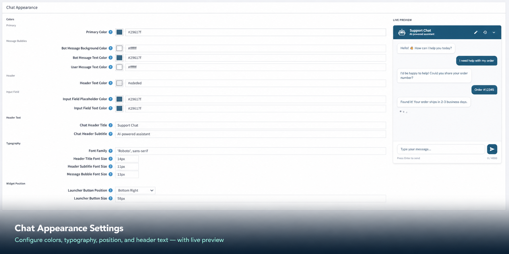
Color Settings
Colors are entered as hex codes (e.g. #3c8dbc). You can pick a color using the color picker icon next to each field.
| Setting |
Default Value |
Description |
| Primary Color |
#3c8dbc |
The main brand color used for buttons, highlights, and key elements. |
| Bot Message Background Color |
#f0f4f8 |
The background color of the chatbot's reply bubbles. |
| Bot Message Text Color |
#3c8dbc |
The text color inside the bot's message bubbles. |
| User Message Text Color |
#ffffff |
The text color inside the customer's message bubbles. |
| Header Text Color |
#ffffff |
The text color displayed in the chat header bar. |
| Input Field Placeholder Color |
#3c8dbc |
The color of the placeholder hint text inside the message input box. |
| Input Field Text Color |
#3c8dbc |
The color of the text the customer types in the input field. |
Text and Label Settings
| Setting |
Default Value |
Description |
| Chat Header Title |
Support Chat |
The main title shown in the top bar of the chat window. |
| Chat Header Subtitle |
AI-powered assistant |
A smaller description shown below the title. |
| Font Family |
'Roboto', sans-serif |
The font used for all text in the chat widget. |
Font Size Settings
| Setting |
Default Value |
Description |
| Header Title Font Size |
14px |
Size of the main title text in the chat header. |
| Header Subtitle Font Size |
11px |
Size of the subtitle text in the chat header. |
| Message Bubble Font Size |
13px |
Size of the text inside all chat message bubbles. |
Layout Settings
| Setting |
Default Value |
Description |
| Launcher Button Position |
Bottom Right |
The floating chat button appears in the bottom-right corner of your store pages. |
| Launcher Button Size |
58px |
The size (diameter) of the floating chat launch button. |
← Previous | Next →